Transgender Network Rebranding
Challenge
Increase the visibility and recognizability of Transgender Netwerk as the leading organization championing the emancipation of transgender people.
Solution
Transgender Netwerk struggled to convey a clear and cohesive identity. The existing visual and communicative elements lacked unity, which meant the organization didn’t project the recognizability and authority needed to effectively support its mission. Additionally, there was a range of online platforms each with their own identity, which created confusion for the target audience.
We started with a brand analysis and a Brand Deck session to identify the organization’s core values: Optimistic, Vibrant, Progressive, and Approachable. These values became the foundation for a new brand manifesto that reinforced Transgender Netwerk’s mission and vision and highlighted its role as a champion of gender diversity.
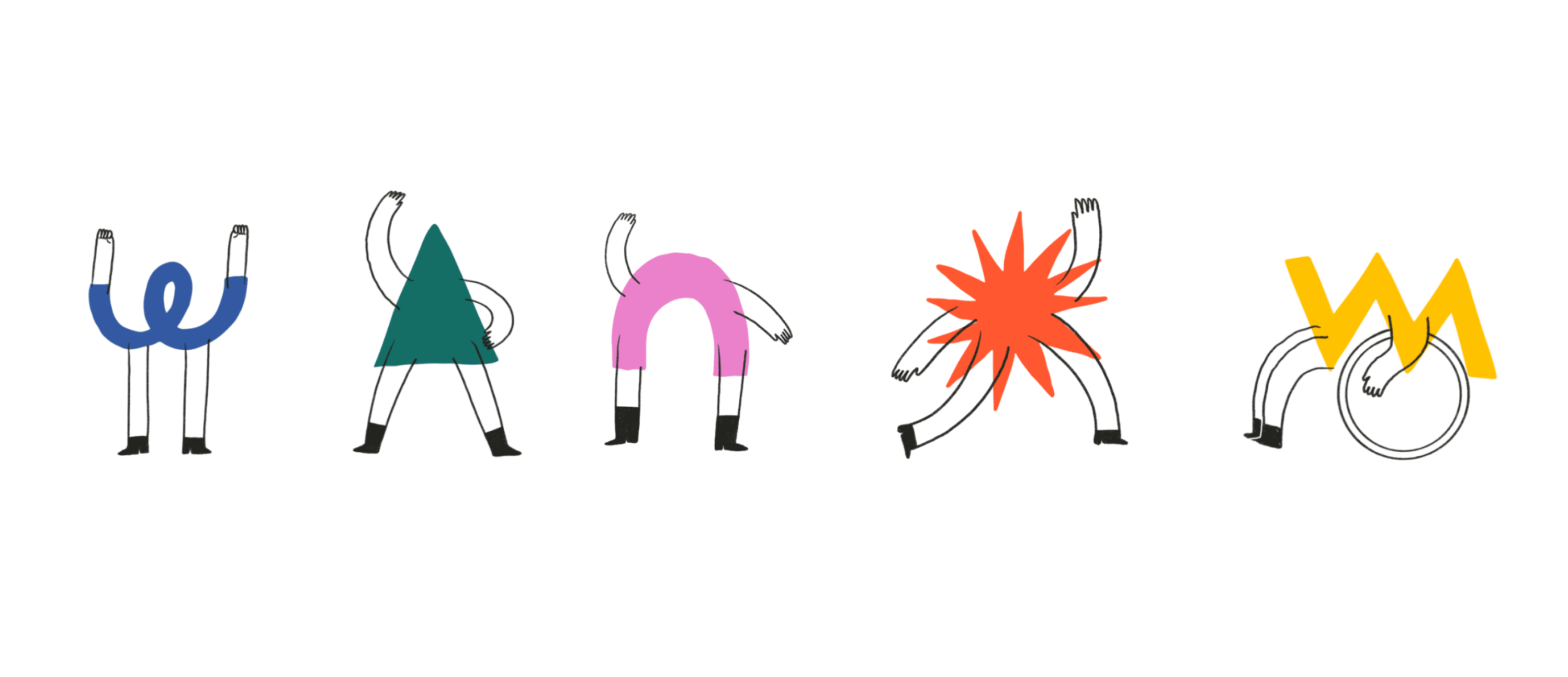
Through visual research, we selected the concept “Gender in all forms” as the central theme for the new visual identity. This concept celebrates the diversity of gender identities by using different graphic shapes as metaphors for gender identity and expression. The result is a multifaceted, inclusive visual language that reflects the unique character of Transgender Netwerk’s community.
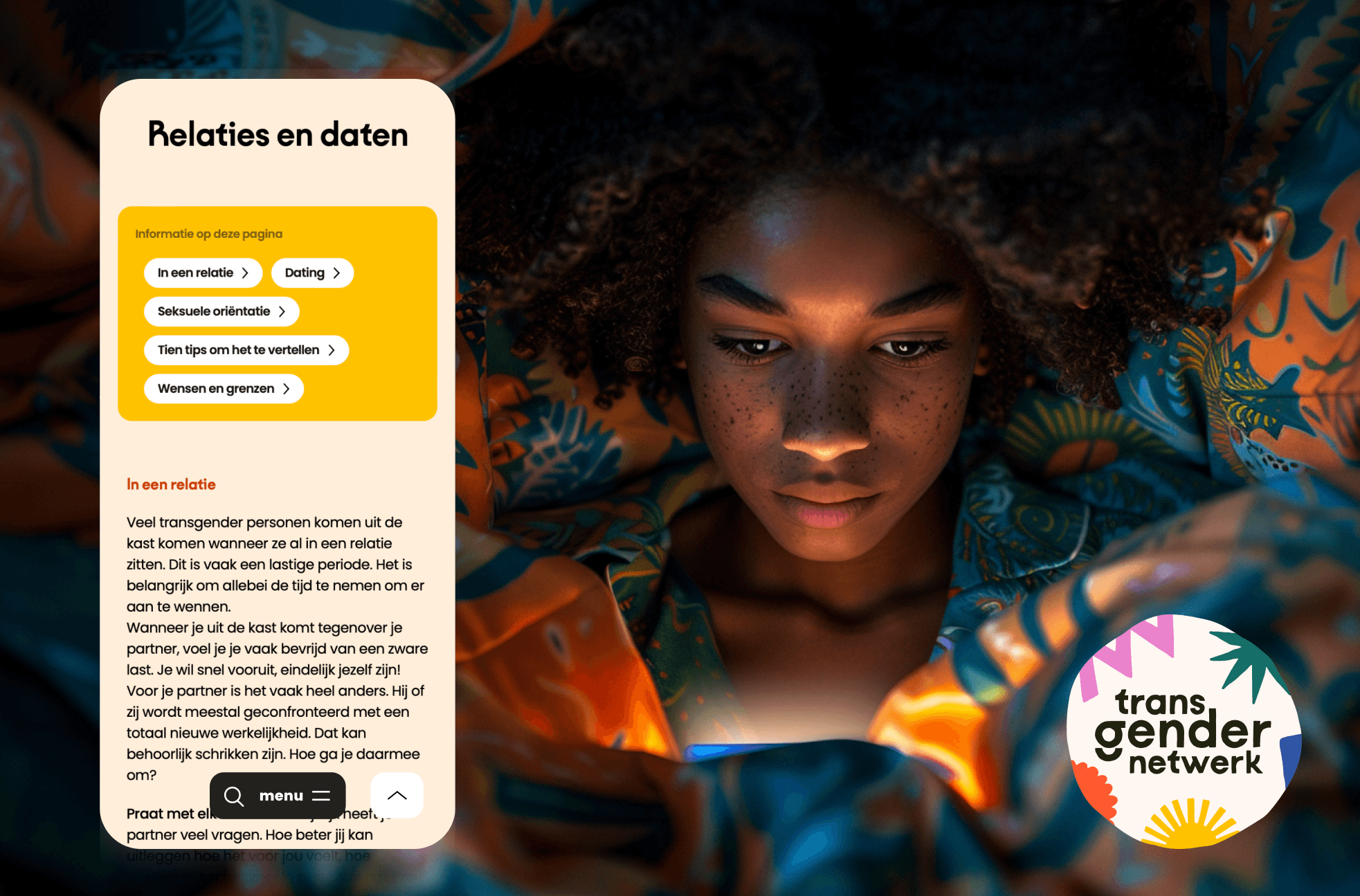
We developed a new brand architecture that brings all activities and information under one recognizable identity. This included consolidating various websites into a new, central Transgender Netwerk website, giving the organization a consistent and powerful presence.
Throughout the process, we gathered feedback from members of the trans community. These perspectives and personal stories were crucial in finding the right tone and expression for the brand identity. The website also incorporated specific features based on these insights, such as content warnings for sensitive topics, prominently displayed emergency numbers on the homepage, and a stronger emphasis on opportunities to connect with other community members.
Implementation
To ensure consistent application of the new brand identity, we created an extensive brand book. This includes guidelines for the use of color, typography, logo, shapes, mascots, and the tone of voice for communication. The color palette, inspired by the Pride flag, radiates optimism and diversity, while the typography strikes a balance between character and readability.
For online and offline communication, we developed a variety of templates and illustrations, enabling Transgender Netwerk to communicate consistently and attractively. On social media, pre-designed Canva templates ensure a visually engaging and accessible presence.
Impact
The new brand identity has significantly improved the visibility and recognizability of Transgender Netwerk among its audience and other stakeholders. The community feels more represented and connected to the organization, which has strengthened support for the shared mission.
The central website now provides a unified access point for all information and support, which not only simplifies maintenance but also ensures clear and consistent external communication. Thanks to this approach, Transgender Netwerk can speak with one voice and deliver its message powerfully, both in politics and throughout society.
Products
brand strategyVisual identityIllustration and visual languageValue propositionUX and webdesignTone of voiceBrand bookTeam
Dirkjan Brummelman (project lead, design)
Twinkel Achterberg (brand strategy, design)
Caroline Blijlevens (digital development)
Sean Mc Donald (digital development)