Fast forward your IT career
Challenge
IT broker Maarten Koekebakker wanted to grow his company Macee and was looking for a strong brand identity to build on.
When we took a closer look at the company, it became clear that the current structure didn’t align well with his future plans. Over the years, Macee had evolved into an organization with many different sub-labels, services, and target groups, making it unclear what Macee actually stood for and what services clients could expect.
Additionally, the name “Macee” didn’t have a clear meaning and was often pronounced in different ways. So the big question became: how can we give Macee a clear position and establish a solid business structure?
Solution
We began with a thorough analysis of where Macee stood and what the plans were for the future. We didn’t just look at Macee itself, but also at the various sub-labels and initiatives. We mapped out the target groups: clients seeking certainty and candidates looking for interesting challenges. From the competitive analysis, it became clear that Macee needed to differentiate itself from both traditional firms and new players—who might be trendy, but often felt impersonal.
In a workshop with Maarten, we clearly divided the services. By aligning Macee directly with the sub-labels, we moved from one company with a broad offering to multiple individual businesses, each with a specific focus and target group. We also decided to establish an overarching group to house all these labels and services.
This shifted our focus: we now needed to develop the name, positioning, and brand identity for this new group.
Brand DNA and positioning
Based on our findings, we developed the group’s brand DNA. The core values became flexibility, reliability, and innovation. This DNA formed the foundation for the brand promise:
“Getting the job done.”
This promise tells clients and candidates that the group always finds a solution, no matter how challenging the situation.
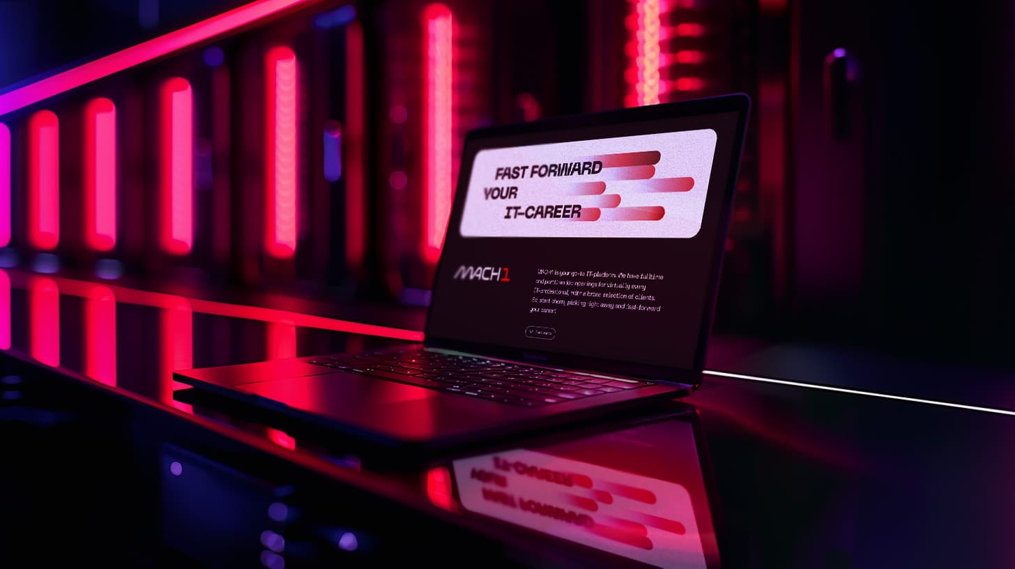
For the naming, we explored associations like energy, strength, speed, innovation, and renewal. After several creative sessions, the name Mach1 stood out. Mach1 breaks staffing barriers for clients and accelerates careers for candidates.
We further developed the brand personality with the Creator archetype, which fits the brand’s innovative, forward-looking nature. This was translated into a modern visual identity with clean lines and a technical look that emphasizes Mach1’s speed and flexibility.
With the brand DNA and visual identity in place, we rolled out the brand across various communication channels and marketing materials. A key milestone was launching the Mach1 Team platform, a kind of “Funda” for IT jobs. In the first phase, we focused on increasing brand awareness and expanding the platform with new features and partnerships.
Team
Dirkjan Brummelman (merkstrategie, design)
Wessel Wildeboer (merkstrategie, copy)
Sean McDonald (web development)

User Experience Design
Based on the brand style created by Cheerleader Agency, we designed a distinctive UX for the job platform with smart search and filtering capabilities.